
Grey is the new Black in the tactical industry, with practically every gear and clothing company producing their own grey kit. The argument for it is simple; grey makes for a great neutral color that works very well in urban environments. But which shade of grey is the best? That’s a question MilSpec Monkey is looking to answer.
Monkey starting seriously looking into what makes the best urban grey due to a number of complaints resulting from MSM’s use of a warm, almost brown grey for their patches. Monkey took a look at various shades of grey being used by industry manufacturers, and found that, generally, they’re too cool, too medium, too “charcoal” to work well in an urban environment. To quote Monkey’s own article: “Although concrete starts out some sort of grey, the outside is a dirty place and dirt tends to be brown.”
Through his research, Monkey is looking to find a warmer, more natural grey for clothing and gear, and we’re eager to see where these efforts lead.
You can check out the full article, and more images, at milspecmonkey.com/index.php/articles-page/63-articles/454-a-real-urban-grey.
Are people buying “urban grey” to blend into buildings? Or are they buying Grey colors to blend the lines of discretion in public, versus rocking black or multicam patterns head to toe?
I’ve never viewed anything grey as a substitute for camouflage, but more like a color to be used in moderation to blend items, clothing, equipment into a normal surrounding without anyone having a second thought or take a second look at it.
maybe I’m missing the point
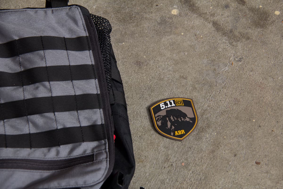
Search: https://www.google.com/?gws_rd=ssl#q=5.11+Storm+Gray+for+Urban+Environments
“50 shades of Grey” jokes in 3….2….
The whole purpose of MAS Grey is to blend into darkness better than black does. Silly urban ninjas, tricks are for kids.
The point of grey is not to camouflage into grey environments, but to mess with the way the human eye perceives light, colour, contrast, etc. I think chasing “the perfect urban grey” is over-thinking the concept. Moderate tone greyscale is hard to perceive at the best of times, but especially in lower light conditions and on the peripherals of vision. That’s it’s strength, not that it’s a colour blend against it’s surroundings.
Best of luck to MSM in his hunt though.
I agree with the Monkey completely. Warm grays (brownish) blend in quite a bit better than cool grays (bluish or greenish). Even Tan 499 blends better in urban areas than Foliage or Wolf Gray.
Depends.
More and more light is going to daylight-calibrated LED (replacing fluorescent and pressurized gas bulbs), which runs blue.
Also, law enforcement agencies are responding to calls to “de-militarize,” meaning no mo’ camo or Ranger Green.
The 50% solution is 18% gray.
I predict vendors that sell mostly to urban agencies will advocate a “cooler” gray, vendors that sell to smaller/more rural agencies will go with a “warmer” gray.
It will take someone huge, with an institutional commitment to color correctness to standardize gray. When the Marines specified Coyote 498 and started rejecting out-of-spec gear, the mills figured it out.
Lighting is also a key, by the way.
Except that dramatic flame-colored sunset, we usually have cold white light outdoors. In this case, cooler tone of gray (“tone” is the correct term, unlike “shade”, because shade stands for gradation of lightness or reflective ability, while tone stands for spectral characteristics) sticks out more from the background – light contains more blue and cool gray reflects it better than warm or neutral gray.
Urban Wolf/Wolf Gray is too blue for my liking.
MAS Gray gets my vote. It looks like cement.
Very interesting bit of research. Looking forward to the MSM conclusions.
Dress uniformly in any one color or any pattern, and you will stand out in a crowd…
I like Wolf Gray is because as the light shifts, WG goes greenish, brownish, or greyish.
+1
I’ve always thought it was more about how light is reflected off of the “Gray” materials. therefore an %18 Gray would be better as it is balanced and reflects neutral colours better. %18 Gray is the midway point between full black and full white.
Or maybe I’m to much into photography and looking at it all differently.
I like Wolf gray as I can get away with it at work as it matches nicely with what they provide us.
Mike
RAL 7013.
How does RAL 7013 compare to MAS grey? They seem similar on the monitor but that’s always deceptive given a multitude of variables. I have MAS grey and Wolf Grey kit in hand. Don’t have any UF Pro RAL 7013 to compare though.
Try some Austrian Bundesheer KAZ03 and KAZ02 if you don’t want to pay an arm and a leg.
Damn, beat me to it.
RAL 7013 is a great brown-grey.
So I’m not alone in thinking this too. 🙂
As an added cool factor – RAL 7013 also equates to the old obsolete Humbrol paint shade ‘Brown Bess’ which was the default equipment drab color for the Colonial Marine equipment in Aliens.
+1 for RAL 7014
+1 for RAL 7013 …damned tiny keyboard
I think what Monkey is doing here is a worthy line of research but my humble observation is that all the environments they are “toning” are on the ground vs. at an elevated or erect level that most of us live our lives in. So I think it would be better to start color matching various walls of structures around town as they are in a natural sight line that more frequently backs our silhouettes and will represent a different color palate than the streets will. Also, I tend to agree that the object isn’t to “camouflage” ones self in the urban medium but to minimize the impact your appearance has on others visual memory connection. People are still going to see you but is their brain going to analyze you or remember you? That is the more important question in my humble opinion.
Cheers
Thanks for the insight, I did get a chance to make larger samples today and look into walls, so far at least in my area concrete walls are pretty bright! General goal wise I’m trying best to blend into an urban environment visually, rather than the grey man concept which is to blend in culturally.
Wolf is too bright, MAS Grey is great, little bit of brown or something in it. Emdom SDU Grey and LBX Glacier Grey are lighter than wolf, but not by much.
I’ve been asking around and hope to get in some samples of the latest popular existing greys. Offhand MAS Grey looks too dark from what I’ve seen in photos (based on the mega contrast with the concrete they lay on.
http://i.imgur.com/G8DeNpR.jpg?1
http://s161.photobucket.com/user/jdizzle921/media/ODA561/3035d145.jpg.html
+1 with MAS Grey. Too bad it’s not more popular, as I think LBT really did do their homework when selecting a grey shade. Grey with a hint of brown in there.
That seems a bit unnecessary…
There was a Haley strategic disruptive environments class that got written up.. Maybe on lightfighter? Anyways- it was an urban environment at night and sure enough, khaki (maybe Matt Johnson Khaki?) really seemed better suited to streetlight illumination in an urban setting.. Better than gray. I hope I’m remembering it correctly- it wasn’t a scientific study- just other people noting the same thing..
Whoops- it was SSD, not lightfighter.. And crocodile, not MJK.. Thanks SSD!
Here:
soldiersystems.net/2012/05/16/what-lurks-in-the-new-york-night/
How about taking ones new grey gear and laying it on the ground, walk over it and then drive over it a few times. You would have a natural looking “urban grey” that should go unnoticed.
About 30 or longer years ago, someone at Natick was pushing the idea of grey, based upon WWI and WWII German “Feldgrau” (Field Grey) uniforms, as THE camo solution for the US Army. I even remember reading an article about it. Heck, it probably DID work pretty good coming out of a trench on a misty Central European morning, but somehow it was envisioned as replacing all our camo, to include Woodland BDU and solid olive greens and olive drabs.
I doubt there is a paper trail, but I would bet that old Natick Grey pet-rock figures in the lineage of the Universal Camouflage PAttern (UCP) ACU disaster. These things take decades to metastasize.
That is very interesting…
No matter how good MAS Grey is, LBT has the lockdown on it’s production and distribution. I do think that it is honestly an ideal color, combining a fairly nice shade of grey with the elusive “iridescent” quality that old Eagle Industries Khaki had (which has a name attached to it that I can’t remember).
I wish LBT would just quit being ridiculous and capitalize on (probably) one of the only truly interesting products they have the rights to. I would buy a Crye/Blue Force Gear anything if it came in MAS grey.
MJK, that’s the acronym. I had never heard of this color being identified with this name until very recently. I don’t remember ever hearing the term prior to Coyote 498 being established.
What are you like 16 and this is your first time on the internet? The adults are speaking here and you need to move along.
Boom.
Keep up the good work MSM, I’m curious how this turns out.
Personally I prefer the lighter or wolf grays as a simple preference and the fact that “Urban Camo” to me is about not sticking out in a crowd while remaining neutral rather than avoiding an air strike.
The thing I like about grey is that I can use high quality milspec gear with out looking Army barmy. If it allows me to blend in to shadows and the environment that’s a bonus.
No grey will work better than RG in an urban environment; RG also has the ability to blend into wooded areas. It also doesn’t scream mall ninja or something of the such like a pair of 5.11 pants and a multicam pack. Stick with RG.
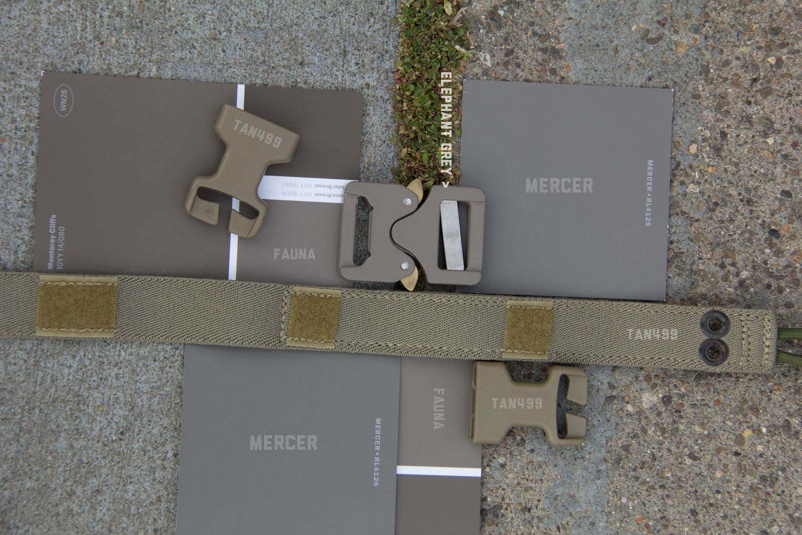
A quick bit of Google Maps research, putting a dropper in multiple locations in SF and NY, yielded a result much closer to the Tan 499 or Fauna colors- basically “dirty sidewalk”, as opposed to the MAS grey that is more “wet cement”. Interesting.
Just my opinion but finding the perfect color won’t be as useful as making clothes and equipment that looks more normal. There’s a difference between blending in color-wise but being easy to notice due to clothing choices vs not being noticed at all because your clothing and appearance don’t stick out at all (think undercover cop).
When I’m on the subway anything MOLLE pretty much catches my eye. Any military colors or patterns do the same including the more subtle khakis, greys, Ranger Greens, etc. What’s funny is that the outdoorsman/climber clothes also catch my attention. This industry is influenced by the civilian rock climbing, camping, etc. industries so I understand why Arcteryx’s Gamma softshell would catch my eye the same way their LEAF softshell would. Not the exact same but enough so that it gives your nose a twitch when someone looks like a walking catalog from a certain company (think 5.11 tuxedo).
When I think grey man clothing with utility, I would rather wear a black Scottvest jacket and pants with Blackhawk Diversion Carry Backpack than a TAD Stealth Hoodie with Grey Ghost Gear Stealth Operator Pack in grey. No disrespect meant to the companies listed (they make great products) but while both provide good features for the user, the first two actually look like what someone who knows nothing about the tactical world might wear and carry. The second two look like what tactical-kinda-people think is low profile. Plus, if you’re wearing patches at all, say good bye camouflage lol.
Or you could, you know, buy normal people clothing and a normal person backpack (or, gasp, briefcase) and, if necessary, modify it internally to fit your needs.
But that wouldn’t get tactical companies $500 of your money, now would it?
I’ve torn the shit out of “normal people clothing” just changing a tire, no thanks.
If you want to be a tactical fashion victim, it’s your choice. Just don’t go around pretending you’re a “gray man” in your $500 Gucci ensemble.
Also I can replace my pants and still make rent.
Sorry, I’m being excessively harsh on you.
My point is that inconspicuous tactical clothing still looks like inconspicuous tactical clothing and thus is by definition extremely conspicuous.
I’m kinda confused…..that’s exactly what I was saying. Have you even looked at scottvest’s stuff? It literally looks like stuff off the rack of a department store. Same goes for that Blackhawk pack. Right now I’m using a Jansport pack because I’m in a major city and can’t CCW so I have no need for a pack that could conceal a pistol. But if I wanted a backpack that had hook/loop inside for a holster or mags or a jacket with good concealed pockets and was durable as hell, yeah I’d probably buy the Blackhawk or Scottvest.
I don’t see why you’re getting so up in arms when we’re basically saying the same thing.
I think it’s about time we saw a serious effort to find a functional, “all-around” urban color. Anyone who has patrolled hostile, urban CZ will tell you this is a grand idea. A few months ago someone let a few pics out showing a certain spec ops unit in a greyish-green uniform (not olive drab, trust me, I know the difference). The effect of adding a green/brown-tint to grey is a legit idea.