
UF pro unveiled their new Urban Grey color at IWA. It is engineered to make a wearer standing, crouching, or laying prone in proximity to buildings and infrastructure harder to spot than if clad in traditional black.
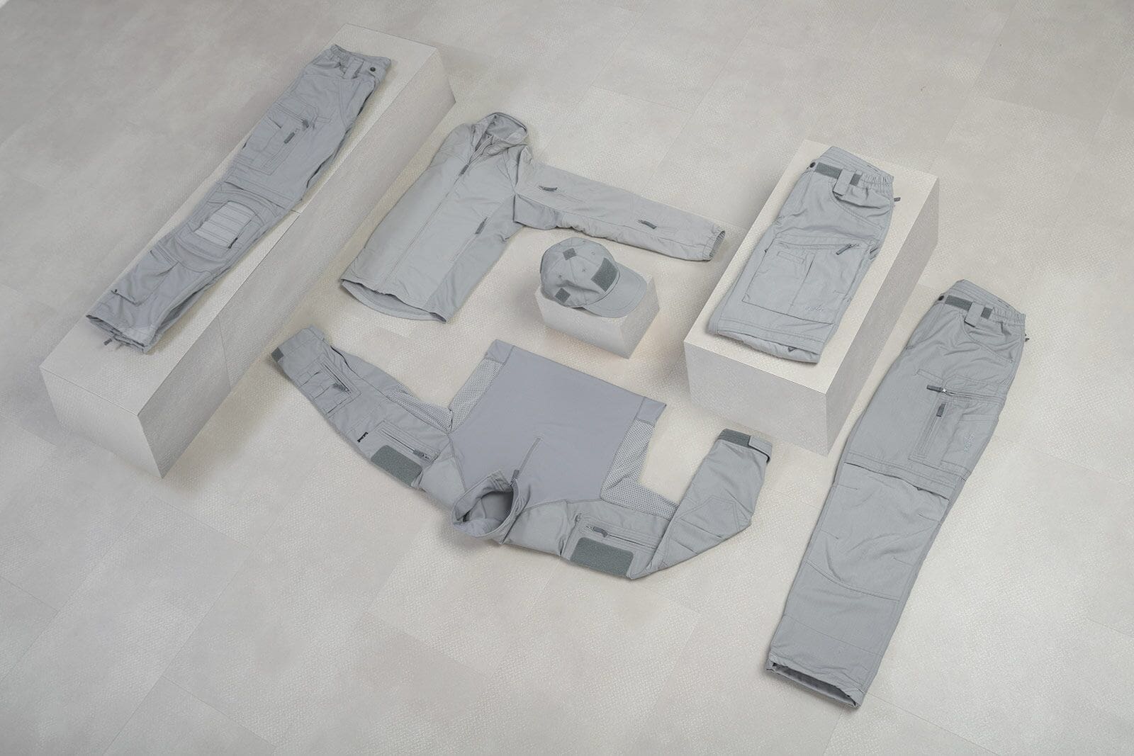
Frost Grey – lighter than other shades of grey currently on the market – was engineered to minimize the visual signatures a person produces amidst a backdrop of granite-faced or concrete buildings.
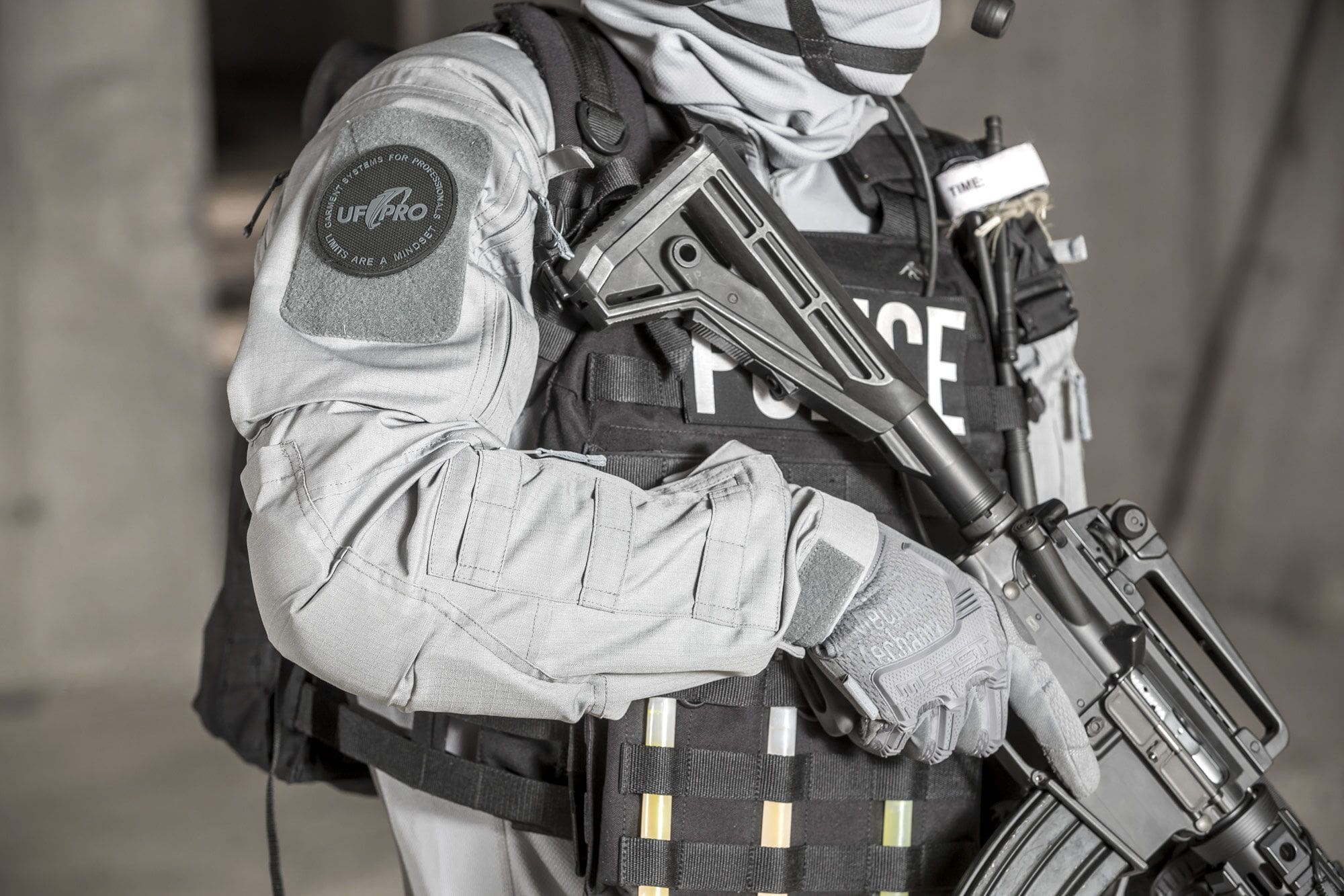
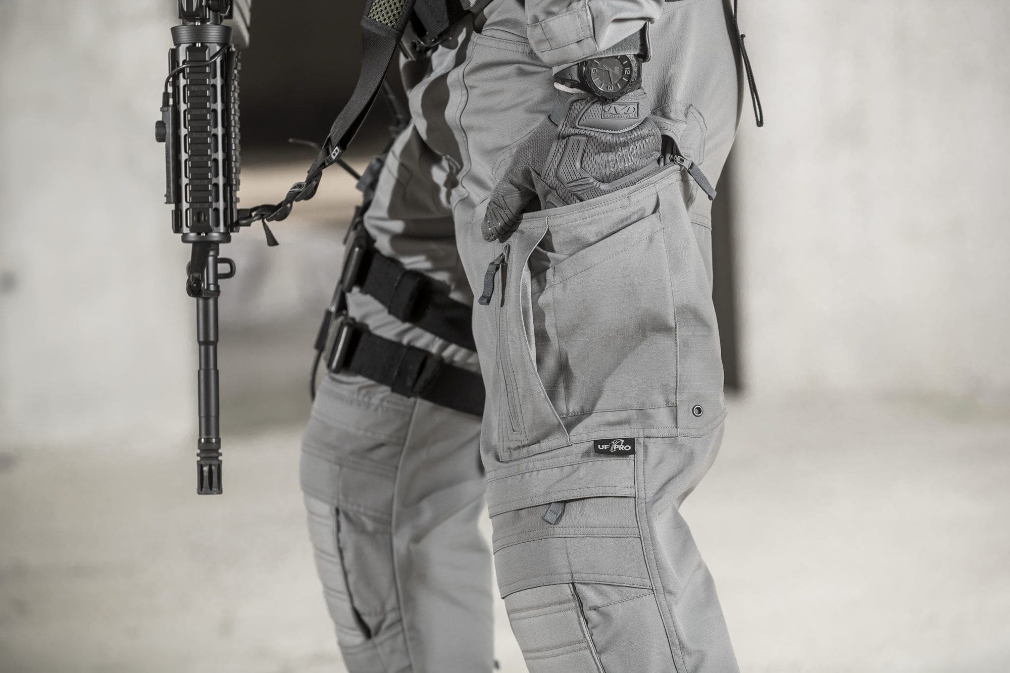
Frost Grey is initially available in the Striker XT Gen.2 battle dress uniform.
• P-40 All-Terrain Pants
• Hunter FZ Jacket
• Delta OL 3.0 Cold Weather Jacket
• Delta AcE Sweater
For more information about Frost Grey, Striker XT Gen.2 BDUs, and other UF PRO products, visit the company’s website.
Tags: UF PRO
quite light for wolf gray wannabe
It’s not it a wannabe. I guess you missed the point. It’s something different.
gotta love them comments eh..?
No dog in the fight but personally I think it will blend better than Wolf. This seems like a color that was chose by utility alone. Wolf seems like a great start, darkened to make it more appealing, but no necessarily more effective.
You must be new, these more closely resemble the PCU issued uniform set, specifically, Gen.1 and 2. Nothing like Wolf Gray developed by an overseas manufacturer, Arc’teryx.
Arc’teryx is an overseas manufacturer? I mean, if you wanted to cross the border by boat rather than land, you’re still only crossing the straight of Juan de Fuca.
As opposed to, say, I don’t know, Slovenia.
Wolf works nicely. I worry that while it is a ‘subdued’ colorway, it’s still awfully pale, kind of like what you saw for that light tan material used on the torso of the Gen 2 Crye Combat Shirt: it’s going to stand out. Lastly, I’m not sure I’d want to doing work with a ‘will melt/will drip’ poly-cotton uniform on.
I dont’t need it. Still love it. Dont know why.
I’m diggin it, it reminds me of the newer colors on some trucks comin thru my shop, called “cement” but this would be a matte version of the gloss Toyota color, even lighter.
Are these for service, LE only?
Nah, everyone can buy those.
So does anyone have firsthand experience with all these new gray uniforms? I understand that they’re supposed to make you “harder to detect” in an urban setting, but the human eye is pretty damn good at picking out the human form, especially? when there’s no foliage to hide behind.
Not sure how that question mark got there…
All about the environment.. But no to the black vest.
Our job is to clash but without contrast.
I think they got a good fit for bright new construction concrete, however curious if that is more common in Europe as it isn’t super rampant here in the US. On my research bright concrete was at the top of the urban brightness scale so once you go around any other materials you super stand out.
Promo wise it would have been better to wear some sort of grey kit…pretty much anything but black would have been better. Someone did a good call on the grey mechanix gloves at least.
As for general urban concealment inquires, just being still can go a long way and in combination with a blending color it can help a lot. Perhaps not the same opportunities as an outside match, which tends to be more consistent, but doesn’t hurt to try.
for what its worth… I think you did a great job on your research on the different “greys”.. thanks for that hard work MSM
I appreciate it! We at least got some hoodies to show off some color ideas, but still need to collab with someone on pants to be able to fully show off the color zone of MSM-Grey.
Why not do some hoodies in the WWII “Dazzle” camo using urban colors? Isn’t camo also about being hard or difficult to make out a form?
Dazzle camo was pretty ship specific with the intent mostly being to confuse range, speed, and heading, basically giving up on hiding visibility.
Offhand I feel urban areas offer pretty good solid color chunks so trying to blend in with that has better chances than super diverse abstract urban shapes printed onto a camo.
There can also be a separation on normal urban settings vs destroyed urban settings, where destroyed is easier to match since it becomes more consistent in color and fractical shapes like say a rocky environment.
Urban areas can have a lot of material and color variety so it helps to try and narrow down the goal matching zones some rather than attempting to do everything at once and thus being pretty half assed at everything.
Thanks Monkey, great reply!
Is UCP going to be cool again?