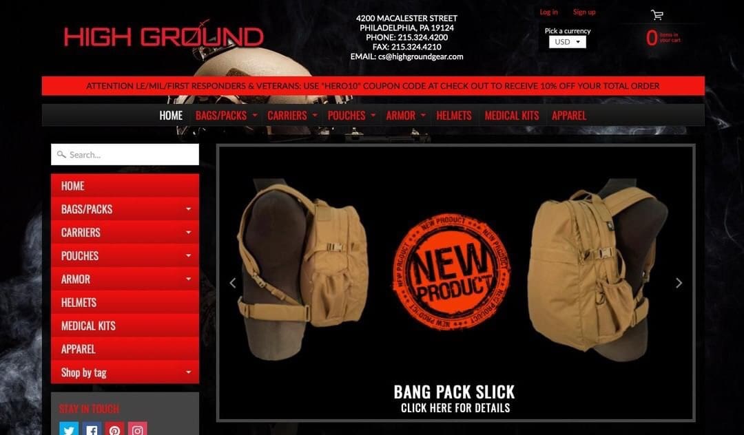
SNEAK PEAK at the new High Ground website launching next Friday September 13, 2019
Make sure to stop by www.highgroundgear.com next week and check it out!

SNEAK PEAK at the new High Ground website launching next Friday September 13, 2019
Make sure to stop by www.highgroundgear.com next week and check it out!
I can’t say that’s much of an improvement, if I’m honest. Not any worse than before, but not better either.
Red writing on black background, any writing on red background especially such a bright read make for really uncomfortable reading.
Sorry, I don’t mean to be a dick!
Also the vertical menu on the left and the horizontal menu up top are identical. Seems like it would be more useful to take the left menu out of there and give more space to the content.
I also don’t see any use to have the address etc so prominent like this in the header. I’d put that in the footer where it remains easily accessible but not as prominent.
Lad,
Thank you for the input, we were having some “coding” errors on the colors, when this screen shot was taken.
Hope the new version looks better.