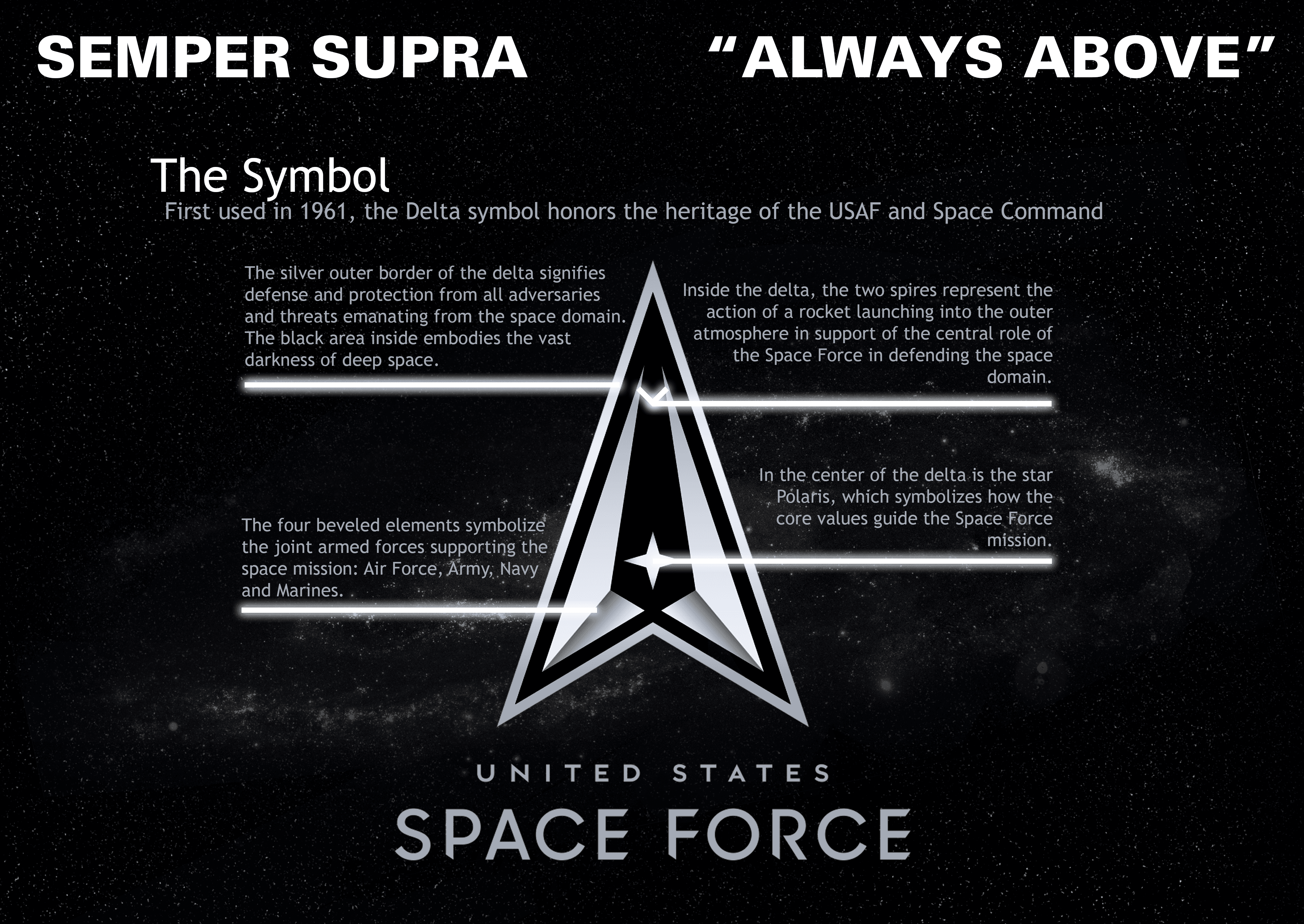
The U.S Space Force released its logo and motto, Semper Supra (Always Above), July 22, 2020 at the Pentagon, D.C. The logo and motto honor the heritage and history of the U.S. Space Force.
(U.S. Space Force graphic by Staff Sgt. James Richardson)

The U.S Space Force released its logo and motto, Semper Supra (Always Above), July 22, 2020 at the Pentagon, D.C. The logo and motto honor the heritage and history of the U.S. Space Force.
(U.S. Space Force graphic by Staff Sgt. James Richardson)
Remind anyone of the Star Trek logo?
Looks heavily influenced by….Pontiac motors.
The USS Pontiac, detached on assignment from Starfleet Command
Don’t say that to starfleet.
Aim High! Fly! Fight!…Aliens!
I almost vomited…..
Compared to the first 6 batch which looked like an intern’s 1 hour attempt this is at least an upgrade.
Looks like a glitzy rip off of the Chinese space agency logo.
Oh good,I’m glad we’re addressing the important questions regarding Space Force… What does the logo look like? All the rest is just nuts and bolts.
You mean, the important questions regarding re-flagging a long-standing COCOM as a separate service. At this point, most of the developmental effort likely IS properly placed on establishing the organizational culture; the big three of who we are, what we do, and the standards “I” (CSO) expect.
I mean, it’s not like the nuts and bolts, as it were, haven’t been in practice since 1985 or so.
Just to be a bit pedantic, COCOM refers to an authority, while CCMD refers to the organization called a Combatant Command.
i saw it on twitter and had to find out if it’s true i mean… space force really? and the logo?? where can i find the original source of the pic ..?? IT’S so unReAlisTIC
As others hav said. Bette rthan other desigsn presented so far, but it looks like the USS Pontiac of Starfleet. Well they can iterate a few times more. The logo is supposed to be used for some time in the future. Better get it right.
But I like the motto for Space Force. Simple and on point. Works on several levels.
For those unaware of the actual lineage of the Delta symbol utilized by NASA/USAF Space Command which the USSF symbol was derived from before this logo version. It’s been in play before Star Trek adopted a variant, this graphic shows where the elements were pulled from: https://i.redd.it/4f4fp75vb5d41.jpg
As a former KS residnet I would have nominated “Ad Astra Per Aspera”
That the South African and Spanish Air Forces’ motto.
For those unaware, the Delta symbol for the USSF was taken from USAF Space Command and NASA elements before being also used in this logo version. Star Trek used a variant for the show based on US Gov usage (not vice versa). Here is a graphic that points out the elements of the official seal design: https://i.redd.it/4f4fp75vb5d41.jpg
Uh, Star Trek “copied” NASA.
The Delta in the Nasa seal/logo has been present since 1959.
Always Above.
But sometimes to the side a little too. So just watch it pal.
I voted for:
“When you own Space, you own everything underneath it.”
They also need music. I vote for the original Dr Who music
Only if we add cheesy lyrics the spacemen are required to sing, badly, at the conclusion of ceremonies. 😉
CHALLENGE ACCEPTED! It couldn’t possibly be any worse than the Army song!
“Always on top”. Sounds like an Thai hooker mission statement…