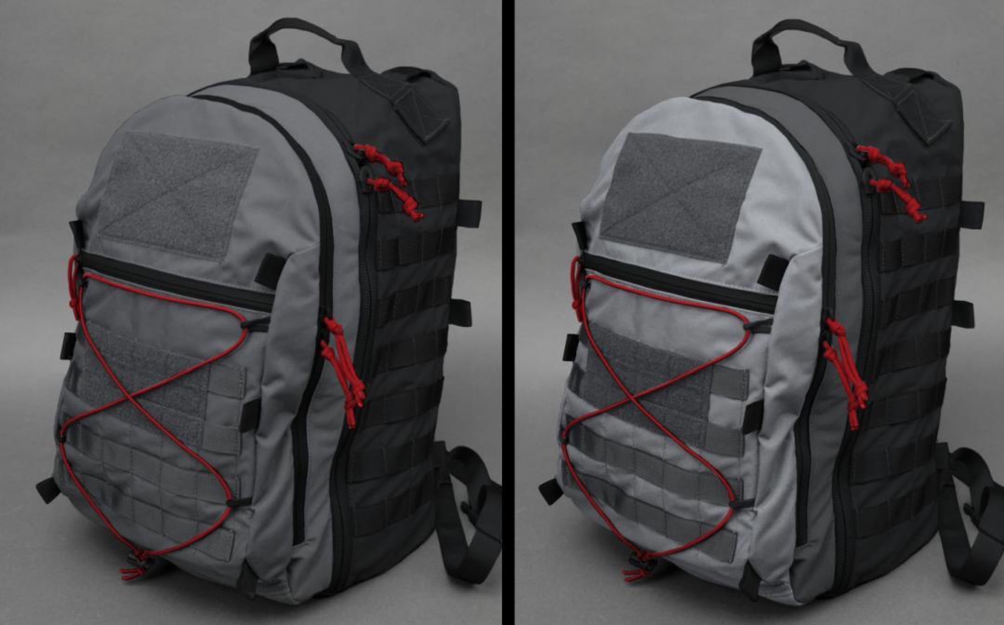
Mil-Spec Monkey is considering doing a run of CYOA packs in an Urban1 color scheme. What do you all think, like the wolf and black on the left, or get more wild with light grey, wolf, and black on the right?

Mil-Spec Monkey is considering doing a run of CYOA packs in an Urban1 color scheme. What do you all think, like the wolf and black on the left, or get more wild with light grey, wolf, and black on the right?
The presence of MOLLE webbing and velcro defeats the entire purpose of a civilian colorway.
Beyond that I like schemes that are still muted but less military looking, like HPG’s foliage/manatee. Black is too limiting.
Needs more rainbows
Hanging out in the hood and projects on a daily basis has taught me one thing. It isn’t weird to see a grown man carrying a my little pony backpack
Velcro and molle gets a second check, sonic the hedge hog gets a smile.
Not anymore. The prevalence of MOLLE on backpacks is at a peak. Anything you get from Wal-Mart has MOLLE, down to the automotive tool bags.
One of my company goals is to find more of a blend of military and civilian designs where people can get the usefulness and quality of the military side, but use for all different kinds of daily use. This is by no means meant to be a covert pack, just a non tactical specific color scheme while getting all the modular functionality of the PALS and loop.
Wolf and black, and Defo ditch the molle and Velcro.
Looks like a great pack, always worth water bottle pockets on the sides.
Good luck.
This + no red on the exterior.
The left one.
The left the one the molle and velcro blend in together with the bag making less noticeable.
Left. Good job.
The pack on the left in wolf and black.
Stick to two tone wolf and black or Light gray and black. Lose the Velcro. Molle doesn’t matter. There are a ton of “civilian” packs with Molle or something that looks like Molle on the market. No one will care.
Ditch the red corsage. Either black or wolf. The red just grabs attention.
The pack on the left
Wolf and Black
1. Loose the red everything
2. Loose the velcro, velcro invites patches, patches are intel for those looking to steal something.
3. Molle is fine, but once again, hanging stuff on the outside invites could be tricky at the wrong time.
4. Both color schemes are fine.
Maybe want to spell lose correctly dude.
Left…again IMHO, if it is meant to be an urban/city pack I would ditch the velcro at least.
I would never use either one as a civilian carry bag but the one on the right looks like a old NES. At least there is a Velcro block to add my Mario moral patch
Right one looks like a NES belongs in it
Both seem fine. Ditching the red makes it look far more military. The red accents help it blend-in in plain sight, which I assume is the idea. The Velcro and molle don’t matter as a ton of civi packs already use them.
WTF is a “mil-spec monkey”?
Yea, all we need is another attempt at a backpack….or a Plate carrier….,,,,I got a beard, I’m an operator.
Where have you been? Mil-Spec Monkey has been around since before the Surge stud.
This is the best comment I have read in a while.
Yeah, monkey has been around my friend. He might not be the latest thing that your arfcom buddies are talking about but he isn’t a joke and has been around for a while.
Monkey is The Man. He’s pretty legit when he does cool-guy stuff and I’ve never been unhappy with anything from them. He takes his colorways seriously – as evidenced by this poll I suppose.
This looks like primarily a tactical pack that can do urban stuff on the weekends as opposed to an urban pack that can kind of do tactical stuff, so I don’t mind the MOLLE. Red accents may actually make it seem more… civilian? Maybe? Jury’s out. Velcro has its place but I agree if this is in any way supposed to be low profile, it might have to go.
You are about the beard? MSM has been around for a long time.
Hard pass on the mall ninja molle. I guess this pack is for the 5.11 / morale patch on your hat crowd.
After thinking about it some more, I like the colors on the right the best. The lighter colors seem a bit less military, and remind me of the old Nintendo.
If the goal is low pro, you can keep the Velcro and molle and just make it green with a Teenage Mutant Ninja Turtle pattern. No one thinks Seal if you’re carrying a TMNT pack. Really not trying to be funny. I mean if your going for a low vis setup, go low viz lol
Heh if we were selln’ more I’d be tempted! And totally agree, sometimes gotta go wild to get out of the usual box, but I’m trying to find a balance where average joe won’t feel silly wearing vs ¯\_?_/¯ I dunno what the kids want these days, someone is buying that OSOE stuff with wacky color combos.
What a shit show. Sorry Monkey if you came to the comments section here looking for a simple –
I like the left or I like the right picture
You have sadly come to the wrong place. It would appear that 3 out of 4 comments would prefer to tell you how terrible your creative ideas are instead of just answering the simple question.
I like the one on the left- velcro, molle, red stuff and all.
Ehe, I guess one way to learn what people are worried about these days. SS was nice enough to post this from one of my social media updates, so without a longer description perhaps some are confused thinking it was supposed to be a covert design (which it isn’t). Thanks for the sympathy and vote!
The lighter shade on right.
Left, with no design modifications.
I’d suggest sticking with a monochromatic color throughout and dropping the red highlights. It makes it look more like a kids school pack than anything else.
Of course the question is begged…why yet another pack?
I’m not pretending it is a revolutionary game changer or anything, but I think did reach the design goal of something a little different maximizing the PALS webbing to make the pack more customizable than most along with the loop interior; At a fair price and made in the USA
https://www.youtube.com/watch?v=LqkdJ9ULtk8
(I get it pretty hard to see any of that from the quick color test pic)
The Black and Wolf grey
The left just because one has velcro doesn’t mean it has to be used and MOLLE is becoming more mainstream.
Wolf and black, ditch the molle.
I like the pack on the left.
velcro and molle is everywhere these days, no one blinks. I have a pack with laser cut molle all over it and people think its for snowboarding.
this whole “if something has a velcro patch or molle – its tactical or military” went out the door like ten years ago.
you can buy buy multicam laptop packs and snowboard packs.
no one cares. People are too busy getting permanent neck damage looking at their cell phones.
No one is out there looking for the guy with molle or velcro on his pack and saying”that guy there – hes an operator”
lol, the whole thing cracks me up.
Wolf and Black. I like it a lot as-is. Two greyscale tones and a color pop is what I like for 98% of performance objects in life, and that hits it perfectly.
If Low-Vis really is a critical priority, I’d make it a bit more like a camera bag with mountaineering inspiration. More bungee, more hooks and mount points to reconfigure that.
That said, my primary use case for this pack would be hauling racing drones, because this is more awesome than the old ATS Raid I’ve been using in that role… so I’d care a lot more about reconfigurable padding amenity options inside.
Left one
make it Wolf on the back ten Light grey and then Black or
all back and bottom black and then the middle light grey and against the back you carry it against wolf grey
this so that any smudge or sign of wear or stains from setting it down or pushed against something while carrying it doesnt show all that much
might aswell make the inside some right color so its easy to see
– but skip the red pulltabs on the zippers red is all bad !
might use different colors of paracord for the pulltabs for zipper to keep them apart
Probably the left – having the velcro/molle bits match the material they’re attached to helps hide them a bit.
Also, what’s going on with your hats? They’ve been out of stock for months now…
Another practical carrier here. Left color scheme is much more versatile, I’m going to agree with most that there should be NO MOLLE, KEEP the VELCRO.
I prefer MORE velcro, but this pack would be just great as long as the MOLLE is gone. Also, reinforce the velcro with extra stitching around and across it so it does not peel off. You can always cover velcro with hook velcro of the same color, rather than running slick.
Keep up the great work!
Although I appreciate knowing what people want and the kind words of support, I’m not sure what is practical about no PALS webbing and putting cover ups on loop velcro that is decently color matched. The only time loop covers made sense to me was back when there were no camo loop options for when people wanted more complete camo coverage.
The PALS webbing isn’t on there just for funzies, it is important to the functionality and unless you are doing some olympic level stuff, the savings of a few ounces seems like a crappy give/take ratio.
The one on the left. As is. I like the red accents, plus it makes the pull tabs easier to find. I swapped some of my pull tabs out to a high contrast color on some of my other packs. It makes them look way less “tactical”. Thanks Monkey.
Wolf and Black.
MSM,
I prefer the color scheme on the left with the PALS and loop matching the main pack color. I very rarely see people using the PALS on the back of a pack, but I do often see side PALS being used. Personally, if I wanted the pack to look more “civilian” I would drop the back PALS field and make a longer vertical loop field that bridged the space between the existing loop. Side PALS should stay though, no one will notice that honestly.