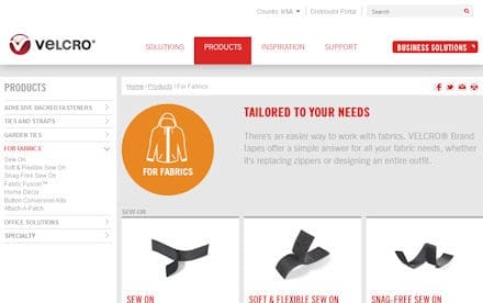
VELCRO has completely revamped their web presence with a new, more intuitive site. Right off the bat, you are immersed in a new homepage that stimulates exploration of VELCRO product uses through a series of interactive scenes including:
• Home
• Office
• Classroom
• Outdoor settings
As you can see above, the content is organized by type and you are only a click or two away from the information you are looking for. Jurjen Jacobs, Vice President of Global Marketing gave this statement in a press release, “Global consumer research was conducted and management teams in every area of the business were consulted to develop sweeping improvements to the user experience. The site is one of the first showcases for the clean, modern visual style that is being implemented across all brand communications from digital media to packaging.”
While it’s not optimized for the tactical user, you might just end up finding a more appropriate product for your application than you used in the past so surf a round a little and see what they have to offer.
Tags: Velcro


