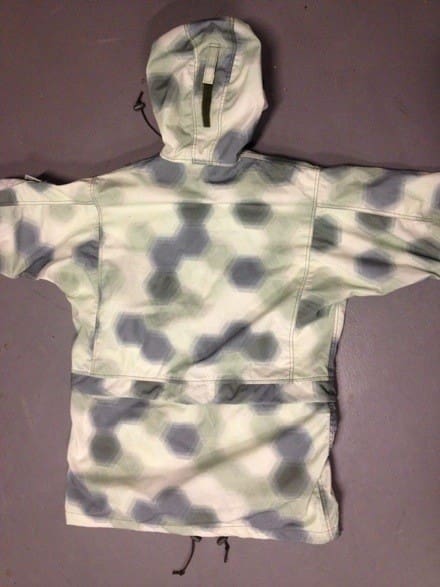
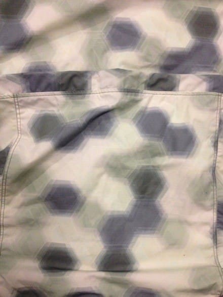
One of the beauties of the digital age of camouflage is that patterns can easily be recolored if needed. There seems to be a lot of interest in the Dispersal pattern by CROPS that we showed earlier in the week but we received several comments that it was too this or that.
This new variant is intended for Alpine use. But it might be the ticket for some of you guys looking for something to blend in with concrete environs, although I find the best urban camo is to dress like the natives.
Tags: CROPS


Designing urban camo is tough.
I like how CROPS is trying to be innovative but I am not impress by the Dispersal pattern so far.
I’d agree with Steven. The palette does look similar to SPIE’s and Hyperstealth’s work deriving optimal color palettes from Huachuca, Slovenia, Canadian cities etc., so it does look quite urban to me.
I also think the macro has good fundamental potential. But there’s basically no visible texturing.
Oddly reminiscent of A-TACS AU, now that I think about it that way…
Reminiscent of German WW1 aircraft camouflage 🙂
Yes, that’s been mentioned.
It was called Lozenge or Buntfarbenanstrich camouflage.
I dig it, sure it could be better, but I like seeing more macro-focused camo.
Interesting. I find it funny how people criticize camo projects based on these close up pics. that’s not how it’ll be used. a lot of the criticism is fashion police. When CadPat came out we weren’t impressed till we got it in the field. A lot of the new patterns are like that.
Reminds me of circa 1980’s tactical board games, ie Squad Leader, Ambush, etc…
Jon, OPT
I see how this can be used in the Alpines but it just looks to white for urban maybe if you switched the white and greenish gray color it would look better for urban but I would like to see it in an urban environment first.
All of these designs are reminding me of those 3D pictures that you stare at.