
Looks like the OCP color issues are worse than we thought.
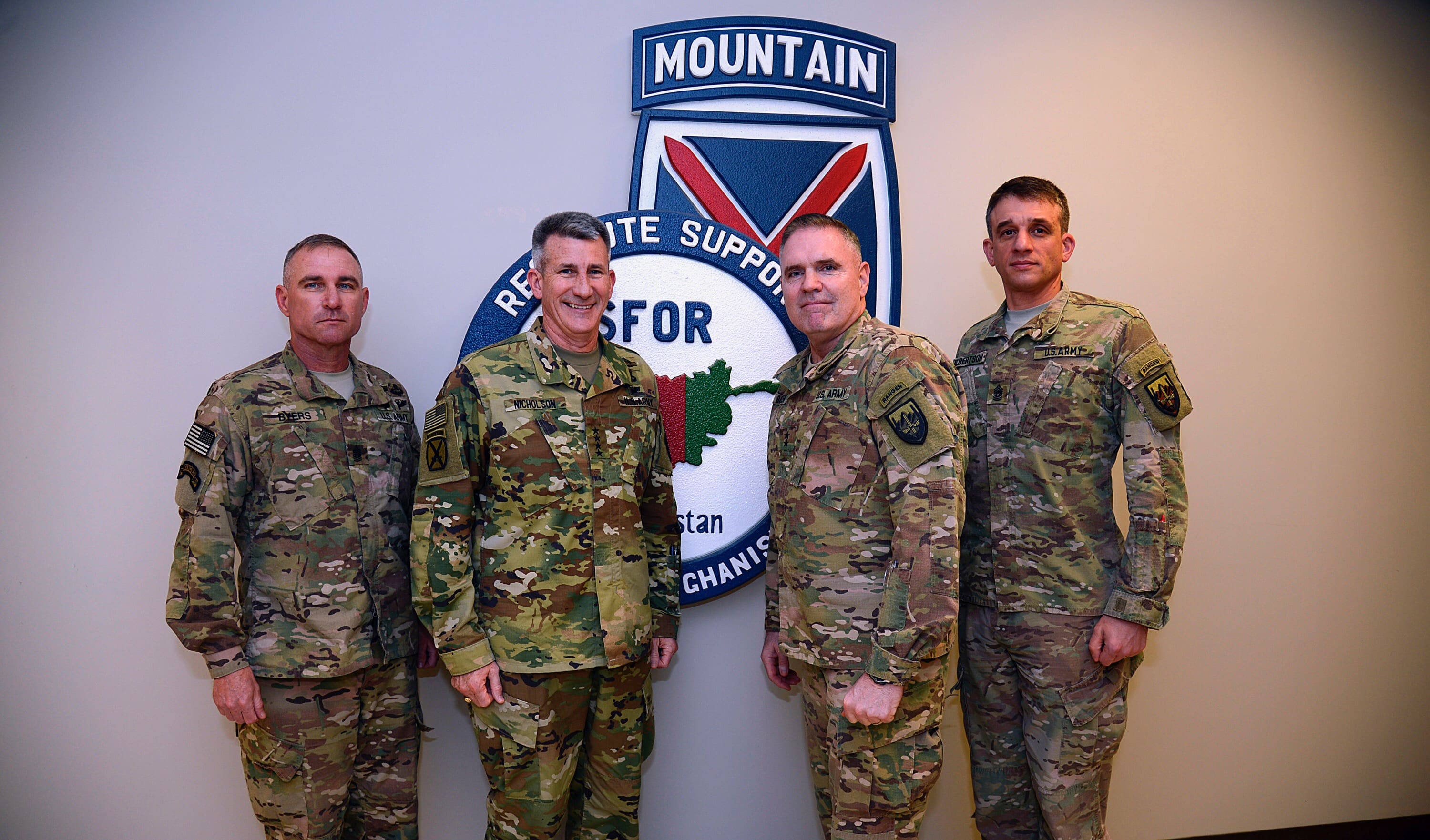
This isn’t just a hat like we showed last time, this is the entire uniform for a Four-Star General, forward deployed, in a combat zone. These are unaltered DoD photographs and the shading problem is obvious next to the other uniforms.
The Army has got to get this printing locked in. Of course, they wouldn’t have this problem if they’d have just kept using MultiCam.
The PALS webbing on that plate carrier is super squared away.
It’s the US Army version of printed OCP webbing. Can’t afford the 6 colors so they went with 4 instead. There is an SSD story on it.
The general officer is wearing the Scorpion II OCP and the other three individuals are wearing the Multi-Cam OCP uniform, look at the pockets and look at the pen/pencil pocket as well! SGM
To paraphrase the former PM, “you can’t patent colors.” OCP uses the same colors as MultiCam. They should be much closer in hue.
From what I can tell with the two types in my closet, the operational (deployed) Multicam is flame resistant while the standard nylon cotton ripstop is not. Take a look between the flame resistant ACU pattern and the standard nylon cotton one and the flame resistant one has a darker Grey hue.
I have a Crye Field Shirt in my closet and it isn’t even remotely that bright.
K, I completely agree with you. The FRACU(Flame Retardant ACU/OCP) were always off in color. They also seem to fade in color very quickly compared to the normal poly cotton blend. Even FRACU OCPs compared to normal our normal printed multicam gear was a different shade of color.
Thats the former CSM of the 75th Ranger Regiment. NBD….
Looks like the difference between a brand new uniform and used. Remember the woodland winter weights non-ripstop? Those things were a mark of a “seasoned” grunt. Damn things would practically turn white after a couple years.
My favorite was when they turned red/purple after a couple of trips to CTA or NTA in Okinawa.
Hell yeah! But You never wore your barracks cammies to NTA. The rip stops always had that red/black tint. JWTC taught me cammies are bullshit.
Also there will always be a difference in color between the uniform and any deuce gear. Check out pics from the 90’s
Just a thought: OCP does fade with time, and blend in seriously well, just as MC, once that happens. It is uber bright when brand new. Just gotta make them ‘salty’ haha
ESPECIALLY the FRACU MultiCam OCP uniforms pushed out through RFI, which the other soldiers appear to be wearing. I have brand new FRACU OCP, 2-year-old FRACU OCP, and ripstop Scorpion II. No two look like the same uniform.
Additionally, the rate of fading and particularly the “dulling” of colors in the FRACU is much faster than ripstop. This is consistent with the experience I had with UCP ripstop vs UCP FRACU.
Wow… somebody remind me what was wrong with Crye’s Multicam??
it was expensive
Multicam was NOT going to be expensive.
Definitely a lot more than OCP (Scorpion W2).
Considering they’re still paying a license fee and Scorpion is less performing, this is more expensive.
Crye isn’t run by some dead weight retired J4 turned “ima get paid” corporate advisor.
You get what you refuse to pay for…
Looks like the General is the only one wearing the standard OCP ACU. The other three look to be wearing FRACUs, which always looked more muted to me.
Exactly.
This–as evidenced by the sleeve pockets with flaps.
Also: This photo was taken with flash (probably off-camera bounce, which lots of people think they’re better at than they actually are). That’s why the guy on the right has a textbook 2:1 contrast ratio and everyone else–even the 4-star who should have been the focus of composition–is symmetrically lit. And fighting the blue facility lighting because the photographer didn’t have time/take time to meter the ambient lighting. Or remove the lens hood for indoor flash shooting.
Flash exaggerates everything–RFI/CIF FR vs. KYLOC non-FR, sometimes even those who have been washing their uniforms in detergents with brighteners, etc.
Photography was simpler when the whole world was lit with tungsten and everyone chosen for historical documentation was a gray-haired white guy wearing wool/cotton/silk in the same palette dyed with the same process…
…and yeah, OCP sucks balls.
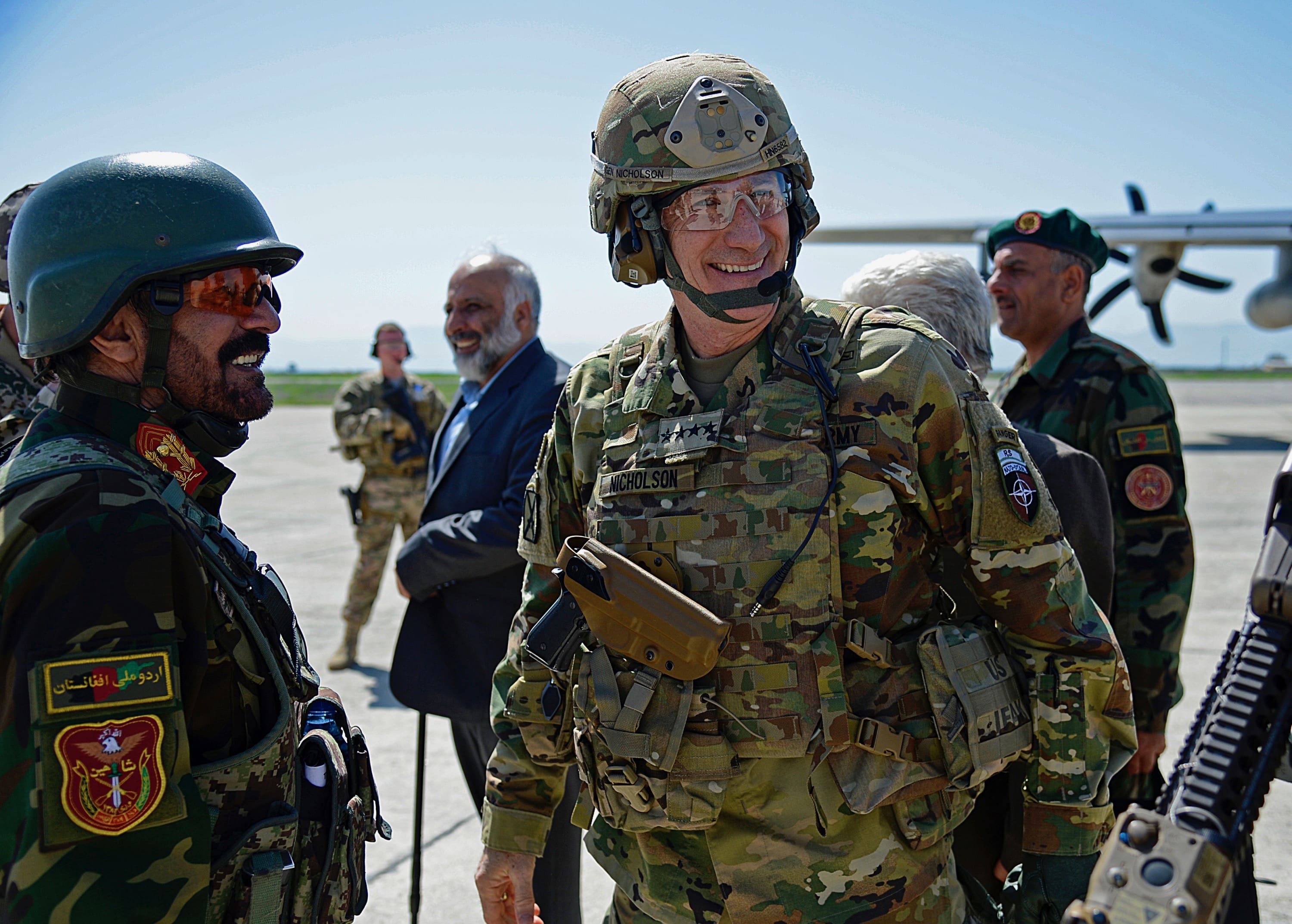
Look at the second photo. The shade is way off.
I hate Scorpion OCP as much as the next guy, but absent a “RAW” format photo with full metadata and (at minimum) a properly-oriented gray card in the corner of the photo, we might as well be arguing about that blue dress from last year.
I have a buck to bet that the shooter pulled that photo into Lightroom, tweaked it so the skin tone on GEN Nicholson’s face would look good and pushed it into the release queue. Afghan officer’s woody cam is pretty dark too…
Here’s a pic of GEN Dempsey that would lead you to believe he’s wearing new pants with an old shirt if you didn’t understand light falloff and temperature.
http://blogs.cfr.org/davidson/files/2015/07/national-military-strategy.jpg
…and yeah, OCP sucks hairy balls.
It’s their photos and the pattern is consistently off, in both photos. The contrast between both sets of uniforms is too extreme even if the photo had been color corrected for his face. Explain all you want, one of these things is not like the other, meaning the issue needs to be fixed.
That’s why PAO shouldn’t take photos. Leave photography to combat camera.
SSD,
This is NOT a misprint with the fabric. GEN Nicholson is most definitely wearing the standard Scorpion garrison OCP uniform. You can tell because all FRACUs have a small square tab on the left pocket of the trousers, and on the left sleeve cuff. He also doesnt have the mandarin collar of FRACU OCP. This is not good photo proof of an issue since FRACU OCPs wear MUCH quicker than the NYCO Scorpion OCPs, and from the looks of it, it is an over-exposed photo, highlighting bright colors. I am active duty in AFG and can attest that it is glaringly obvious when a solider wears a garrison uniform instead of FRACUs, which seems to be the case here.
It doesn’t matter if this is a ACU vice an FRACU. The shade is way off. It is evident in both photos which were taken under different conditions.
Once again, DoD sets color shade standards for its equipment. This is a narrow band of shade variations so that the pattern will perform as designed. When they accept fabric that does not meet the spec, it will not perform. There are always issues when a new pattern is rolled out. The point here, is that there shouldn’t be any issues. This is a shit sandwich the Army made for itself. It had a well performing camouflage pattern and a supply chain that was very good at printing it. Instead, it decided to compromise the performance of your camouflage pattern and opened itself up to every issue associated with reinventing the wheel. It was all done for the sake of hubris.
Just when you thought it was safe to go back in the water….
I see lots of comments from folks who don’t understand printing or how fabrics are certified for shade.
I know from my other job that it is a challenge to get colors to appear EXACTLY right and consistent across multiple types of fabric – BUT, this colors on this set of ACUs look WAY off…
To my eyes, and taking into account that colors also look different across different computer monitors / screens, this looks like 2 things have happened:
A. The colors didn’t get dialled in correctly before the fabric was printed
B. The colors also look over-saturated; like what happens when the pressure pushing the dyes into the fabric is too high when its being printed
Regarding B.; this can happen sometimes at the beginning of a print run when the settings haven’t yet been fully tweaked to the right levels.
At any rate, this fabric should never have been accepted – let alone sewn up into a uniform.
Somebody’s not doing their job.
Who is gonna make them do their job? Nobody.
Same thing was happening with specifically desert MARPAT in the last three years. Last year they finally pulled the pink batch of fabric from exchanges. I could never understand why it was accepted at all based on all of the colors deviating significantly from the originals. Government is the answer in sure.
Most likely difference in materials.
The other three in the top photo are likely to be wearing FRACUs (Rayon base) which tends to come a little ‘salty’ even as brand new.
The general’s uniform seems like NyCo ripstop cloth on which camo VAT print comes much crisper and vibrant.
This is nothing new, we have had this ‘issue’ with Multicam print on NyCo vs Tencate FR Rayon.
This ^
^ Correct
Very true. You can immediately notice the same thing when some high speed joe buys an non-fracu multicam uniform. Shit’s bright as fuck in comparison.
Maybe he bought an Airsoft Copy from a China Shop?
I’ve said it before, and I’ll say it again.
Buy once, Crye once.
This time it’s got nothing to do with Crye. It’s the material.
DoD’s shade program exists specifically to ensure patterns look the same no matter what material it is printed on.
True, but that hasn’t worked so far. There’s only one US-mil contracted supplier of FR ripstop cloth used for FRACUs – Tencate, which produces so-called Defender material.
Camo patterns printed on Tencate Defender rayon are noticeabbly subdued and saltier when compared to camos printed on NyCo ripstop.
It’s been like that from 2010. This is why SF guys stood out in their Multicam combats when compared to US army grunts in their FRACUs.
Yes, the coloring is slightly different, but that OCP ACU should not be that bright.
The average consumer doesn’t understand this… If FRACU is consistently more muted than plain NYCO then someone is accepting a sub-par product.
Read this story from 2008.
https://soldiersystems.net/2008/06/18/usmc-combat-desert-jacket/
They eventually worked out the shade for the CDJ. They need to do this for OCP.
I would agree with the others that mentioned different fabric and different use grades.
I would like to add that the Aramid flight crew uniforms I have in Multicam do also have quite vibrant colors.
The thing about shade certification is that they strive to keep the same shades of colors in spite of the different substrates.
Eric, as others pointed out, this has been a problem since the very first FRACUs came out in 2010. The print on FR rayon is considerably more muted than the print on NyCo material. It’s a fact.
You didn’t seem to have pointed out this as an issue and make it a big deal back then, but you seem persistent in you view that it’s somehow now a new issue with OCP camo print. It’s NOT new.
What is new, are the wild color variations being accepted for OCP.
Just take a look at the second photo. The SPCS is nowhere near as bright as the uniform.
This looks more like Mitchell pattern than OCP.
To hell with the uniform (and yes, it’s the difference between FRACU and 50/50 NYCO.
I’m more amazed by the side plates on that shitty carrier.
Side plate it is not. It’s an IFAK pouch. Look closer.
Look again, that IFAK is mounted to the SPCS’s craptastic, floppy, side plate pocket.
Good catch. Thanks
Looks like more operator error than bad gear to me.
The hue sort of reminds me of the Australian pattern (or is it the old Australian pattern?).
That general smiles too much.
I am currently deployed and the variations are extreme enough that I sometimes mistake the different versions of the OCPs for different uniforms at a distance. Combine that with the British version running around…..
Those greyish shade MTP sets on the market.. Good lord.
The general’s wife (or aide) washed his uniform with a detergent that contains optical brighteners. Now we finally know what happens when you wash ACUs in detergent containing optical brighteners! Thank you GEN Nicholson!
Funny, I was about to post the exact same thing “Someone used PHOSPHATES!!!”
That made me laugh
Looks like it would suit tropical enrolments well I remember fondly out tropic Dpmwhich was brighter more yellowy than temperate and they worked a treat in Belize and Brunei normal Dpm went too dark once it was covered in mud and wet whereas the brighter colours muted nicely
Good thing that we are writing about the uniforms that the OEF/ORS/OWhatever Command Team personnel are wearing, and not how well the war is going. Uniforms are important and win wars, after all.
This isn’t the blog you’re looking for. Seriously, this isn’t that blog.
There is significant variation in brightness on the new OCP uniforms. As I stated on the earlier post about the hat, just walk into Clothing Sales and walk down the aisle with the new uniforms. The color intensity variation can be clearly seen. In the case of the photo above I have to agree with most of the other posts, a used or new FRACU will look muted next to a new OCP uniform. This is nothing new. The same difference in color intensity was also very common with both the green and the brown dominant VN era ERDL jungle uniforms. At the end of the day I don’t think it makes any difference. Some will just fade faster then others.
The uniform makes him an easier target but he’s a General so is this really such a bad thing?
I checked my FRACUs vs my new OCPs and I guess I lucked out as they’re noticably different, but not shiny like the General’s. I wonder if anyone has tried out the Tru Spec Multicam version? Is it closer to FRACU or OCP I wonder.
I got a set just to see. They’re definitely different compared to the mcss ocp but no one at work seems to either notice or care. They actually fit a bit better than the official ACUs.
TRU fits better? Maybe if you’re a fatbody. I’ve got to size down on TRU just to prevent from sweating in those baggy boys. I will admit they got the color down perfect.
Wow. Dick much?
I was as surprised as anyone that they actually fit better in the chest and shoulders than the current issue tops. And for the record I am not a “fatbody”
Wasn’t anything towards you Brother. I just don’t like the fit, wasn’t made for a lot of guys as all. Lol
Ah understood.
Like I said I just wanted to see how they worked and was pleasantly surprised at the fit. I’ve worn tru uniforms off n on for a long time and I’ve never quite liked the fit, especially their BDUs from pre 2005. We had some of their older Multicam ACUs used to us a couple years ago and they weren’t compatible for fit at all. But I gave this latest generation ACU a try and was pleased that they fit me better than the official OCPs. The only negative remark about them I would give concerns the area where the IR tab would be isn’t centered very well, and the Velcro tab itself is too long for the loop, so it bunched up a bit
Interesting. Might be worth the extra investment for the next uniform…
It looks like they got the fading/blending wrong. Too hard of an edge to the pattern.
Ah! How I’ve missed these posts about the “camo wars”
The colors on the new OCPs definitely appear to vary from batch to batch. The uniforms that they sell at SOCOM seem more in line with Multicam color wise and they also seem to have more blotches and busier pattern work compared to the uniforms I saw for sale at MacDill and Eglin
Didn’t have a clue of what anyone was going on about……..then I put my sun glasses on.
If you think that is bad, you should dig up some photos of the initial roll out of the ABU uniform around 2010-2011. One of my first blouses in the new pattern had a noticeably different color fabric used for the cuff on one sleeve compared to the rest of the garment. To hell with matching the rest of my unit or my pants being the same as my top. My left arm did not match my right!
The worst part about that, as bad as it was, it drove one printer into bankruptcy when they had to eat a whole lot of misprinted fabric and I mean a lot.
This is why we can’t have nice things.
Thanks, Obama.
No, thanks Bob Mortlock.
Something’s certainly fucky with the colouring and the way that armour goes together at the front.
But I’m seriously wondering what the point of that canteen pouch below the G-Code is?
Snacks.
We had an officer who had just bought a set of OCPs come into the office with the sleeves sewn on backwards. He was complaining about how the zippers were impossible to get to and then he noticed that the pen pockets were on the back of his forearm…hilarious.
Anyone know if the Propper or Tru Spec versions in Multicam run true to size? Are they better, worse, or same as standard OCP ACUs? If they’re this bad here I can’t imagine how worthless they are in the field, at least until they get the printing squared away.
I own a Multicam ACU pants made by Propper International, among others. They are exactly the same cut and fit as the current USGI ACUs. With added advantage of genuine Cordura Mil-Spec NYCO Ripstop material in Multicam, instead of that pajama-like USGI FRACUs in Multicam or latest USGI ACUs in Scorpion W2 NYCO Ripstop.