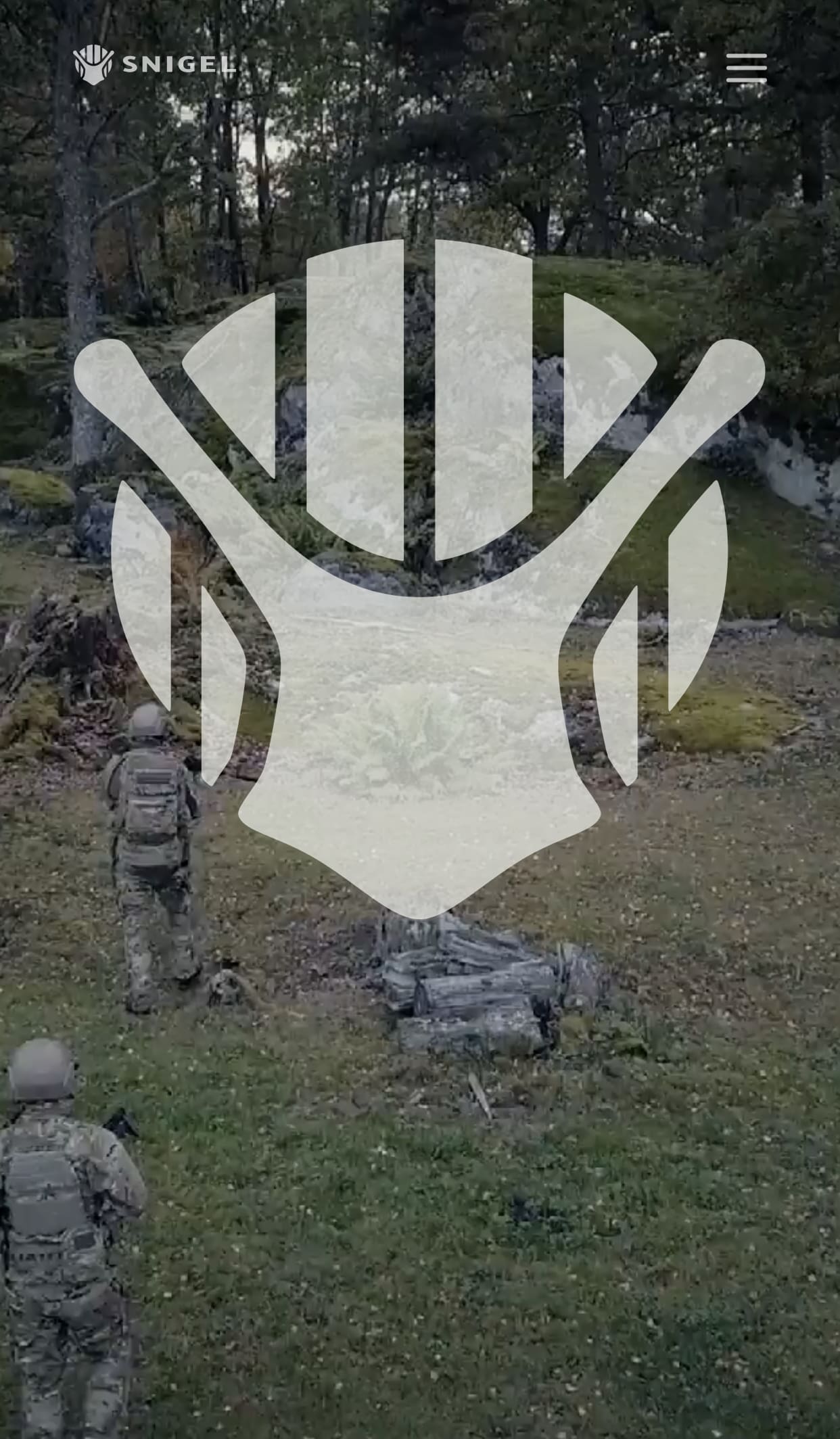
After 30 years, Sweden’s Snigel Design is rebranding. How do you think it compares to the old logo?

This entry was posted
on Friday, February 14th, 2020 at 21:00 and is filed under Industry, International.
You can follow any responses to this entry through the RSS 2.0 feed.
Both comments and pings are currently closed.


not sure how it compares to the old one, but this one looks like an aerial view of a human sitting spread-eagle on an Adirondack chair
I see a snails face, wearing a frap helmet.
?????
I cant unsee that now
Just needs the beer bottles to finish the image.
Mandalorian Snail?
neither are good. a snail in tactical branding will never be easy.
A snail carries his armor/house around all of the time.
The old logo looks like a snail also. Is that by design?
Yeah, Snigel is Swedish for Snail.
Knights used to fight and joust snails. Google it.
I appreciate the concept, but I didn’t understand what it was until I saw the old logo.
Looks like a stylized Predator to me.