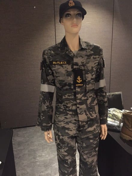
This is the replacement of the Disruptive Pattern Print (DPP)-derived Disruptive Pattern Naval Uniform (DPNU) with the MCP-derived Maritime Multicam Camouflage Uniform (MMCU) for the Royal Australian Navy.
This entry was posted
on Sunday, March 25th, 2018 at 16:00 and is filed under Camo, International.
You can follow any responses to this entry through the RSS 2.0 feed.
Both comments and pings are currently closed.
Man, the Aussies really got it right with their new Army pattern, but the Air Force and now this Navy one just look stupid. I feel slightly better knowing that as bad as UCP is, it ain’t the worst camo out there.
Minus the reflective strips, I’d still take this over UCP..
I hate myself for not hating this.
Are those reflective strips on the arms??? Why waste money on a camo pattern only to add reflective strips to heighten visibility. Who thinks up this stuff?
I feel like Naval camo uniforms are usual less about actually camouflaging yourself against the environment and more about making oil/mechanical fluid stains less noticeable. The reflective bits are there because if you go overboard, you WANT to be seen
It is all about brand, ADF pattern, Navy colours. Except for the reflective stripes, it is a good pallet for Littoral ops.
Than there is that convention thing about uniformed combatants that everyone forgets to consider.
“Uniformed combatants” means being easily and readily identifiable country of origin. It doesn’t say service distinction. Having multiple camouflage patterns for different branches of service for a tiny Defence Force is stupid and a waste of money. Not to mention not needing camouflage properties.
Seems like a half-way decent Urban/Night camo for LE. I don’t see why Sailors can’t wear olive drab or navy blue tops and bottoms. Camo for sailors always struck me as extravagant.
USCG wears navy blue tops and bottoms. Looks fine. The USN should have gone that route a decade ago when they decided to go with the blue digi camo.
Google US NAVY coveralls.
In use for a few decades and to this day.
The old RAN pattern looked very similar to swatches I saw in the 1980’s of the proposed ‘Urban’ pattern in the AUSCAM family.
Have heard it said that the current patterns are more to justify costs/royalties post Midpoint rejection.
No. Just no.
Cool. “Multi-cam Grey” on a Bradley Manning doll. LoL.
Looks good, and I understand the logic.
Just like Multicam Black, this Aussie Navy pattern looks like it could be a good option for law enforcement use….although it might be too “militarized” for some with sensitive eyes.
On a side note, I wonder: is this what dogs see, whenever they look at a human wearing Multicam?
Still too dark. I would love to see a tan- grey- medium brown- green multicam, might actually work . This and MC black just aren’t intended to really be camouflage. Lots of good colors for urban and night, black just isn’t one of them.
Right on.
I totally agree that neither this new Aussie Navy, nor the MC Black, are actual “camouflage” patterns….and I don’t think that anyone ever would claim that they were intended to be.
They both sure do look tough, though.
Yet another ridiculous and pointless “branding” exercise – although at least it doesn’t look quite as atrocious as the Australian Air Force blue version….
The reflective strips on the arms are a carry-over from the previous version of the camo uniform which was actually a kind of cool urban / suburban grey version of the old Jelly-Bean / Bunny Ears camo.
Some bright spark in HQ obviously that i would be a safety hazard to have camouflaged sailors on board ships, so he / she insisted on adding reflective strips in order to kill the camouflaging effect of the camouflage…
Actually, the reflective stripes pre-dated the whole camouflage thing and were on the Navy grey coveralls from the 1990s & early 2000s. Just a(n I’ll-advised) hold over.