Last week in the village of Steenwijk, the Dutch joint Soldier Systems Knowledge Centre (joint kenniscentrum militair & uitrusting) presented a display of some of the latest camouflage work.
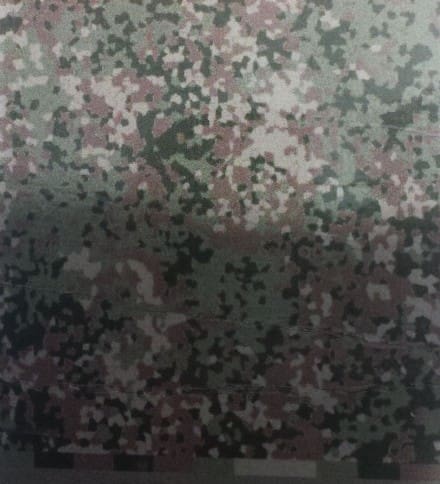
On display was an entirely new pattern which is intended for all personal equipment, regardless of the uniform being worn (NFP-woodland or NFP-tan) like the OCIE pattern of the US Army Camouflage Improvement Effort. The pattern is still awaiting final approval from the Commander of the Dutch Forces with fielding commencing around 2014/2015. This should also include a new set of equipment with a plate carrier as a base, instead of the cureent issue ops vest.
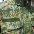
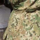
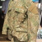
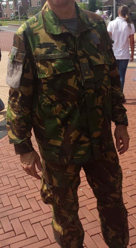
Of particular interest was a trial uniform in Dutch DPM being worn by one of the Centre’s officers. It offers a different cut and pocket layout.
Tags: Netherlands


It’s good to see at least one countries Army isn’t scared to choose a Camo pattern 😉
+1 to that statement.
On the other hand, this pattern has been tested for a while now (longer than the US camo improvement programme actually!). It’s time to actually field it! So in that perspective both the US and the Netherlands are at the same point.
Now from someone who is going to have to wear this stuff. I hate NFP woodland, to much light gray. It looks like we are going to make the same mistake the US did with fielding DCP. Now that new pattern I like very much. A bit Multicam-ish. The uniform itself I’m happy with, it does away with the snap closures we currently use.
P.S. : Seen the new scaleable helmet in the 3rd picture?
Sander that helmet is just a mock-up. I wish they would stop wasting any more money on the Galea helmet project and start buying ops-core/revision/crye helmets which do exactly the same.
I partially agree with you on the grey colours on the new uniform (the same goes for the grey underwear) but I understand you need to have some form of contrast in a pattern te break up at distance. So these greyish spots mimic lighter spots in forests, for example created by direct sunlight.
In forms of fashionable appeal, my vote goes to the NFP-tan but having seen the woodland version a couple of times now I’m quite convinced it’s a good pattern. Just hoping companies will be offering products in the patterns.
http://s7.postimg.org/lmv8s1rij/1070100_604691646238319_2102359439_n.png
Doesn’t look too bad, especially in an arid environment, i’m sure NFP-Green will do fine, especially not being so dark as DPM.
Forests have lots of grey in them; especially at ground level. having a neutral grey will have a similar effect to coyote brown in MARPAT (it will take on the appearence of colors in the environment nearest to it when viewed from a distance). think of Field Grey used by the Germans in WWII…
Northern continental European and Scandinavian forests are wet, and during the winter it’s full of trunks covered with mosses and lichens. Look at Finnish M05 cold weather pattern (not the white one) – you will find the same colors and almost the same spatial frequencies.
Another one joins the suez pattern
Sorry, but this looks like German SS-Flecktarn !! Copycat 😉
NPF-tan looks more like Sturm-MilTec “aridfleck” with a bit smaller spots http://sturm-miltec.com/images/Jackets%20field/10501055.jpg
Interesting. A little Flecktarn like, but so what? As long as it works. I don’t complain about Americans using the Cadpat pattern. You can’t tell on the cat walk if it works (other than UCP), you need to try it in the field.