Polartec® (then Malden Mills) provided wool fabric to the U.S. government from the early 1900s, which was turned into uniforms. In the 1980s, Polartec created the first technical fleece for climbers, and it quickly became ubiquitous. It has been recognized as one of the 100 most important inventions of the 20th century by Time magazine, among countless other accolades.
In 1998, then Malden Mills owner Aaron Feuerstein hired David Costello to diversify the business of the company, and he, along with his colleague Jane Hunter, started traveling down the road to the U.S. Army Natick Soldier Systems Center. Their focus, initially, was cold weather clothing, and they started working on ways to leverage Polartec’s fabric innovation expertise to create better cold weather combat uniforms.
They immediately saw an opportunity to develop specific textiles for base layer, mid layer, and heavier weight fleece. One of the great benefits of working with the government is they can afford to do far better and more thorough testing than any company can, including extensive laboratories with testing equipment and field testing in extreme environments. They put product on 200 Marines, collected tons of scientific data, and assembled it into an informative report. This gave Polartec a heightened sense of what works.
The first Polartec product to be adopted was a Polartec® Classic 100 fleece, which replaced an acrylic wool sweater for the United States Marine Corps. Only one item had ever received higher field test ratings than the new Polartec fleece: M&M’s that had been added to MREs.
With this success, Polartec began traveling to Washington, D.C., to expedite the process of providing better gear for warfighters. These efforts succeeded through the appropriations of funding in the defense budget for the Marine Corps and Army, and helped accelerate the adoption of additional Polartec products.
When U.S. troops were deployed to Afghanistan, Rick Elder, an Army Ranger and Product Officer at Natick, wanted to update what was then the GEN II E.C.W.C.S. system into something that worked better for modern war environments faced by the Special Forces. Moshe Rock, a former Israeli military soldier who headed Polartec R&D at the time, developed Polartec® Power Dry® as a baselayer and militarized Polartec® Power Grid™ for U.S. Special Forces. Gadi Vainer, who still drives product innovation at Polartec, worked to develop what is now Polartec® High Loft™ fleece.
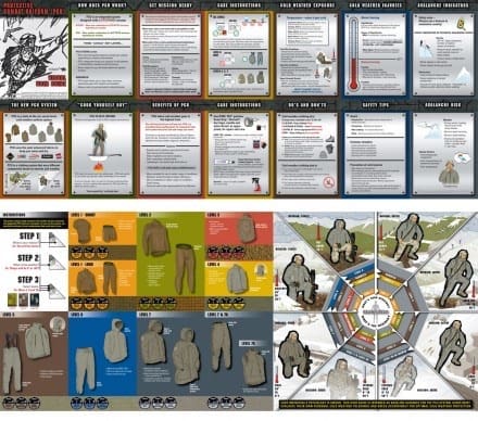
These products, integrated with some shell technology and additional insulation, created a system that worked for modern environments and was able to be adapted to modern warfighter needs in a seamless way.
The efforts of Polartec to advance the products did not go unnoticed by the Army, and would soon be adopted for the new GEN III E.C.W.C.S.. Polartec developed the foundation of this system (Levels I, II, III) engineered to be super packable, transfer moisture and dry quickly. They were designed to work together as a clothing system, and the U.S. Army made the decision that every person in the Army would be issued that system. It was a significant improvement in the ability to outlast the enemy in any environment and the system is still in deployment today.
Polartec has recently introduced its Polartec® Military Issue Collection, bringing these iconic, American-made, military-issue fabric technologies and finished garments directly to all Americans. Polartec GEN III E.C.W.C.S. products and the Polartec® Military Issue Collection include:
E.C.W.C.S. Level I Silkweight Shirt and Pants, the foundation of the modern GEN III E.C.W.C.S. layering system, made of a soft and comfortable Polartec® Silkweight fabric for versatile next-to-skin performance that includes fast wicking action and dry times, high durability and compressibility
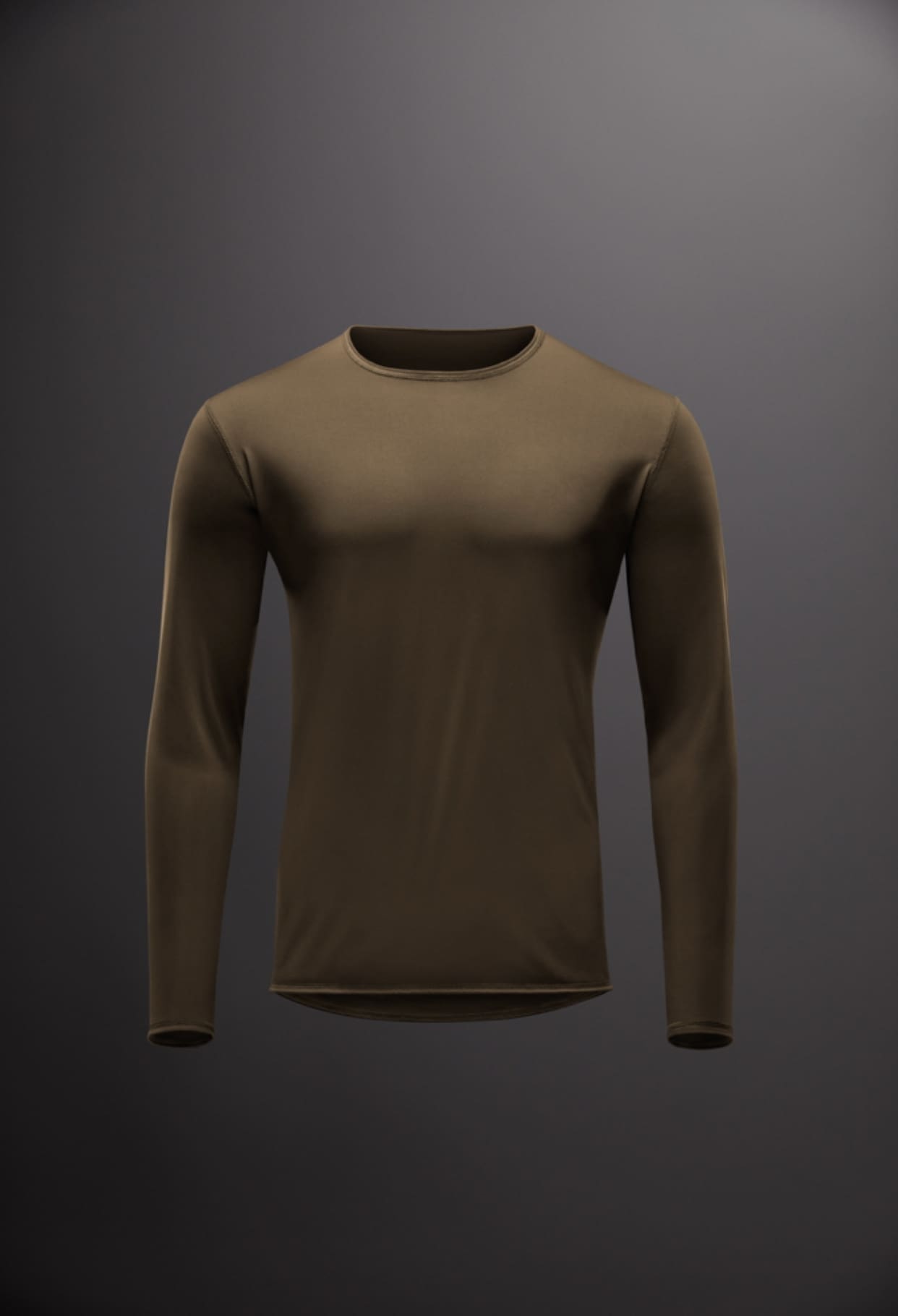
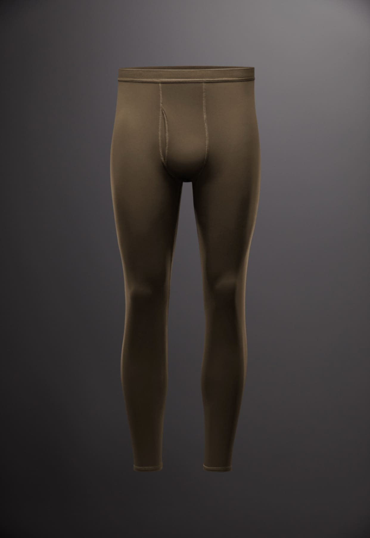
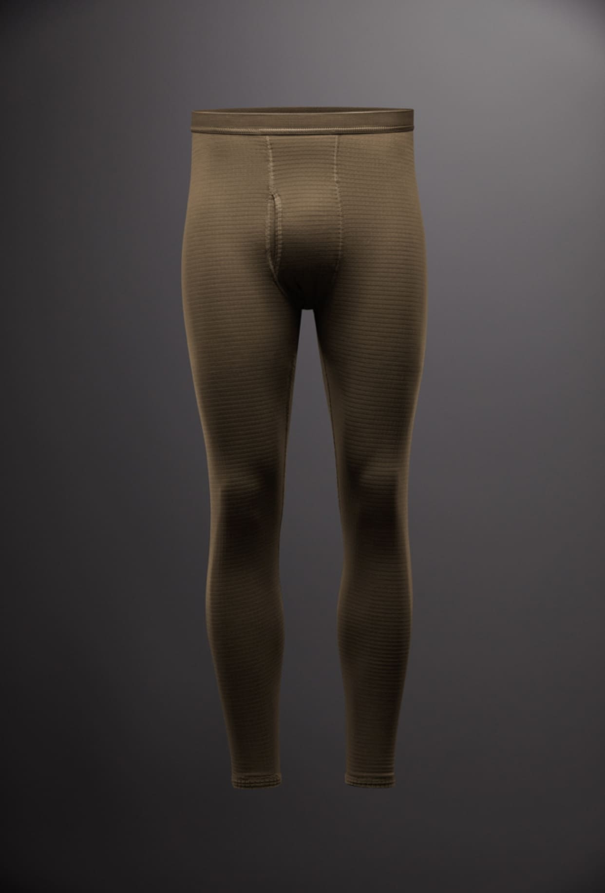
E.C.W.C.S. Level II Grid Knit Shirt and Pants, the legendary “waffle” shirt, made of iconic (and patented) Polartec® Power Grid™ bi-component knit fabric, which maximizes warmth, breathability, wicking action, compressibility and versatility, while minimizing dry-times and weight.
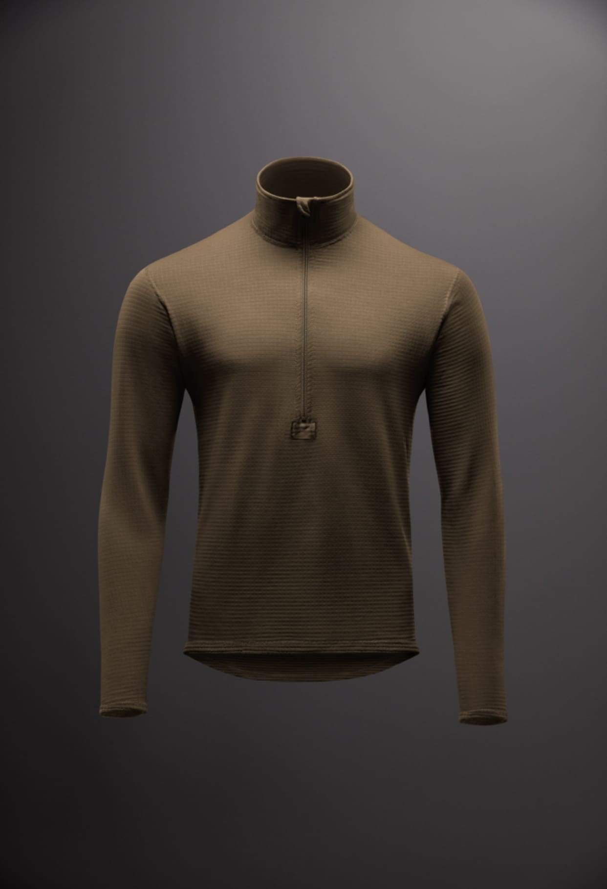
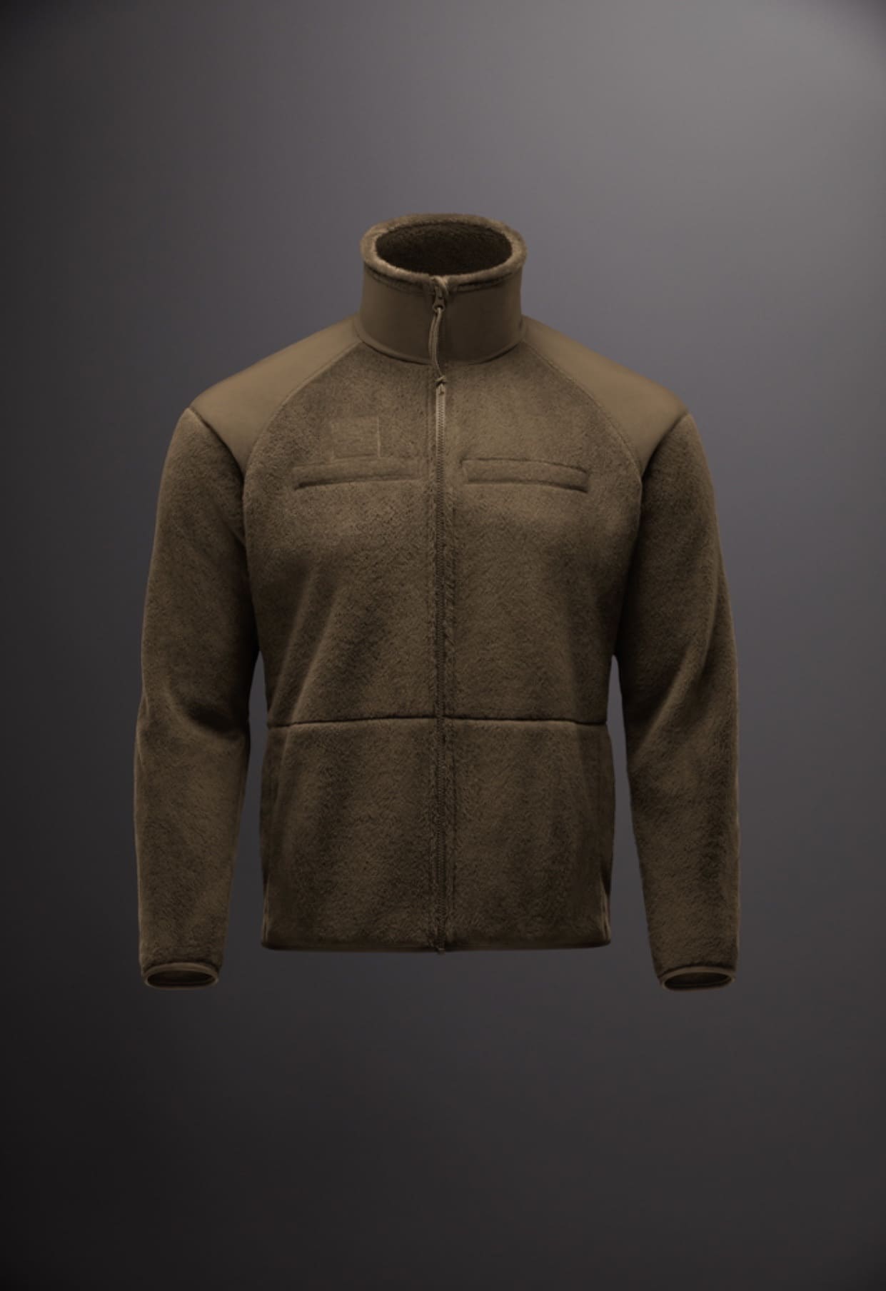
E.C.W.C.S. Level III High Loft Jacket, the “smoking jacket,” made primarily of Polartec® High Loft™, the ultra soft and compressible fleece for warmth without weight, with Polartec® Power Grid panels
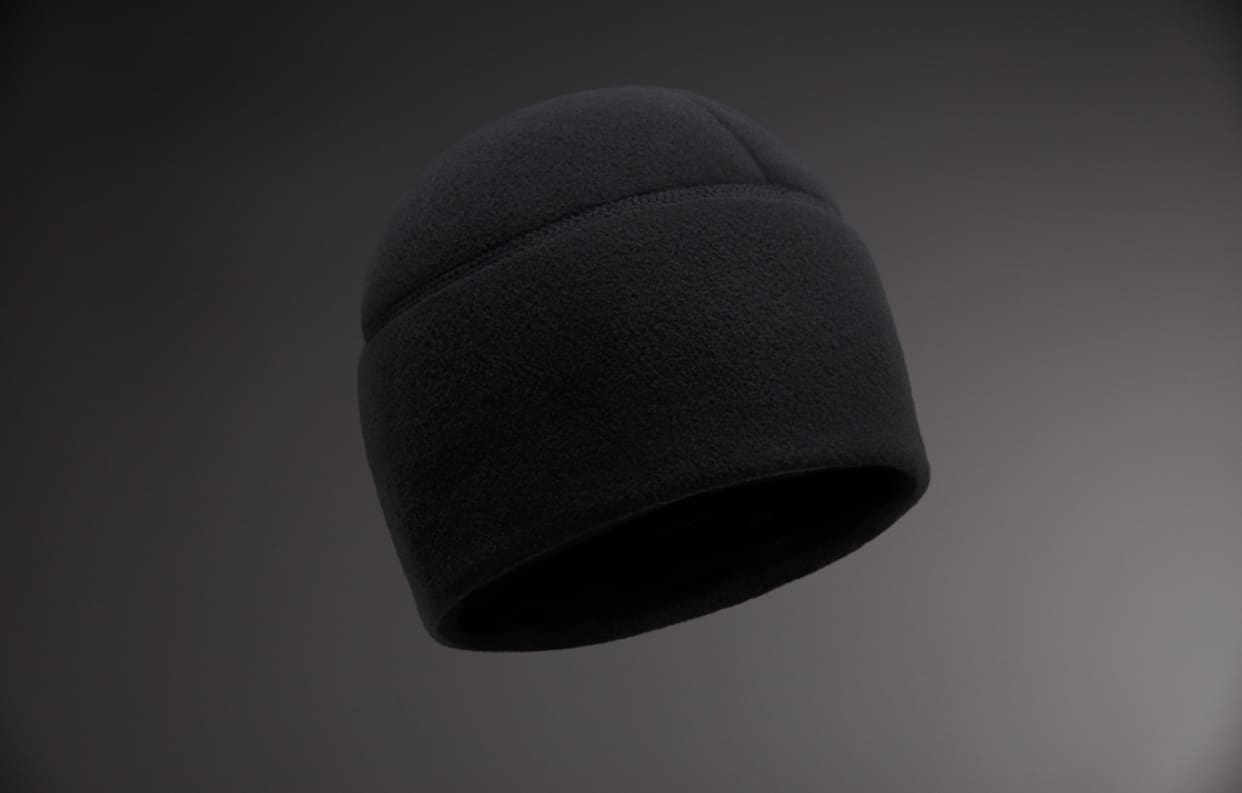
Micro Fleece Cap, small enough to stash anywhere for critical warmth, made of warm, highly compressible and lightweight Polartec® Micro series fleece in a durable three-panel construction
“We have long noticed veterans, active military, or even just the tactically-inclined reaching out to us directly, in search of these authentic military grade products,” says Polartec President Steve Layton. “No one should have to roll the dice on a blurry eBay photo or questionable shopping link to get a new pair of their favorite long underwear, “waffle” grid mid-weight top, or favorite “smoking jacket” design.”
Thanks to Polartec for the details!


